
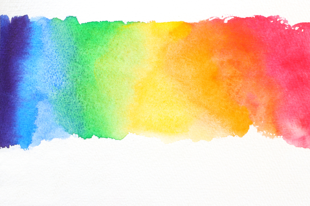
Ever notice yourself using the same colors time and time again when creating a color palette for your home? Although it normally comes down to a matter of taste, the shades you gravitate toward can give you a glimpse into the qualities of your personality.
Red
The first color in the rainbow’s arc is often associated with love and passion. This vibrant shade exudes energy and strength, so incorporating it into your design style means you want to make a statement.
Because of its rich pigment, it is best incorporated in small touches around the area or within intricate patterns. Using natural red tones like a dusty brick, light terracotta, and a blushy coral will soften the harshness of this daring color.
Using shades of red as an accent color in your home is a bold choice, but when done well, the space captures attention and creates an energetic and lively atmosphere.
Orange

The second color in the spectrum is mostly related to warmth and creativity. It is a bright and organic color that typically evokes positive emotion and is normally associated with the autumn months, so using it in your home will create a cozy and rustic space.
There are a variety of ways to bring orange into your decor, and the essence of the room depends on which shade you decide on. Deeper oranges create a warm and organic atmosphere that complements bohemian and eclectic homes best because of their resemblance to nature.
Brighter and lighter shades of orange like peach and gold create a young and vibrant space full of positive energy and creativity. It is difficult to go wrong when bringing this versatile color into your home. Orange you glad you picked this color?
Yellow
The last of the warm tones on the color wheel, yellow, emulates happiness and sunshine. Bringing this cheerful and lively hue into your space inspires productivity and energy, so using it in an office or kitchen will surely keep you motivated throughout the day.
Because of yellow’s luminosity, it works well in small and dark rooms to brighten the space and is often seen in coastal-style homes to recreate the sunshine of the outdoors. It can also be used in a mid-century modern home as a pop of color in a room of neutrals or as a color block complementing other bold tones.
Green
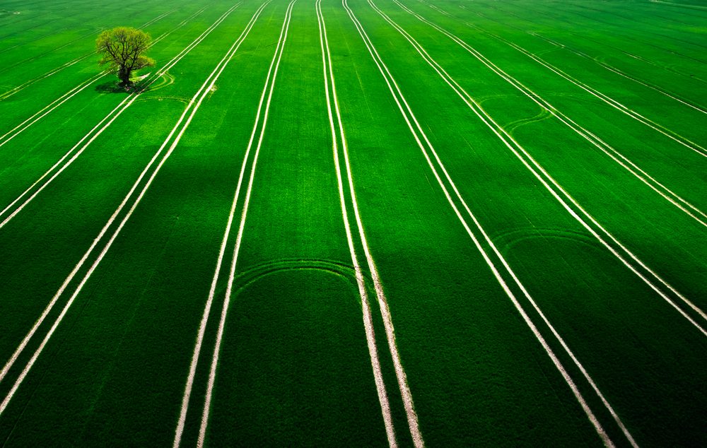
The color of life is seen all around us and represents growth and renewal. Many are drawn to shades of green because of its refreshing nature and rejuvenating quality. It can also exude a sense of regality because of its representation in money and precious gems.
Incorporating this color into your living area can be done simply by bringing in greenery from the outdoors. Using flora to liven up the space will create a warm and inviting environment that will keep you feeling relaxed and refreshed. Utilizing this color in your home will create a space of renewal and life.
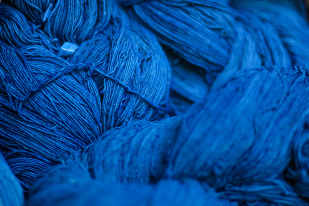
Blue
Like the calming ebb and flow of ocean water, the color blue creates a tranquil and relaxing sense of peace. Blue is a soft and mellow color with many healing and comforting properties, and it is one of the best tones to use in a space meant for decompressing like a bedroom, living room, or bathroom.
Because of its mellow nature, blue can be used in grander scales than some of the others on this list. Sapphire accent walls or cornflower area rugs can bring life and color into the room without feeling overwhelming.
Darker shades can be used as anchors in an otherwise neutral color palette, allowing the eye to easily move around the room. However it is used, you can count on blue to keep your home a sanctuary of serenity.
Indigo
Although a somewhat controversial color, it still holds value when used in your living space. Often associated with the night sky, indigo is a color of mystery and wonder. Incorporating it in your home gives the area a moody and ethereal nature.
The atmosphere of whimsy can be incorporated with your furniture and artwork. Materials like velvet will elevate the regality of this deep shade and create a cozy and comforting home fit for royalty.
Violet
Representing luxury and imagination, violet will elevate the glamour in your living space. Light or dark this color demands respect but maintains a graceful essence. Found primarily in eclectic and glam homes because of its rich jewel tone, this shade is both powerful and subtle – a perfect balance for any home.
You can incorporate it seamlessly in any room and get creative with the design. Try pairing it with art deco pieces for a classic radiance or organic materials for a bohemian dream home.
No Comments