
Living in a small space comes with its own set of challenges, but with the right design choices, you can make even the tiniest rooms feel more open and inviting. One powerful tool in your design arsenal is color. Selecting the perfect color combinations, complemented by thoughtfully chosen wall arts and custom tapestry can wield transformative power. By harmonizing colors that resonate with your preferences, you not only infuse the illusion of space but also curate an atmosphere that resonates with your personal style.
In this blog post, we’ll explore some color combinations that can create the illusion of space and transform your compact spaces into a more expansive and clutter-free zones.
- Light and Neutral Tones
One of the most effective ways to open up a small space is by using light and neutral colors. Shades like soft whites, light grays, and beige create an airy and uncluttered atmosphere. These colors reflect natural light, making the room feel brighter and more expansive.
Consider painting walls, ceilings, and even furniture in these tones to achieve a cohesive and spacious look. Incorporating custom wall arts or wall art decor in the complementary color palette can further amplify the impact.
- Monochromatic Schemes
Choosing a monochromatic color scheme involves using varying shades of a single color. This creates a harmonious and seamless look that tricks the eye into perceiving more space. For example, using different shades of blue or green throughout the room can create a sense of continuity and openness.
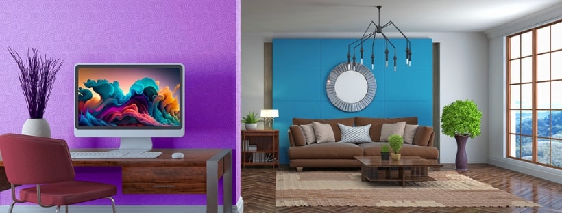
- Optical Illusions with Light and Dark Contrasts
Experiment with light and dark contrasts to create visual interest and depth. Darker colors on one wall, combined with lighter colors on the opposite walls, can give the impression of depth and dimension. Just be cautious not to go too dark in a small space, as it may feel cramped.
Colors that Make a Room Look Bigger
Pale Blue:
- Soothing Serenity: Pale blue isn’t just a color; it’s a gentle touch that creates a calming atmosphere.
- Illusionary Brilliance: When paired with light colors on ceilings, trim, and doors, it magically expands the visual boundaries of your room.
Dark Blue:
- Dramatic Elegance: Indulge in the richness of navy and indigo for a touch of sophistication.
- Visual Stimulation: Whether as an accent wall or paired with similar hues, dark blue creates a visual spectacle that enhances the perceived size of your space.
Soft Black:
- Subtle Grandeur: Soft black introduces a touch of grandeur, especially in rooms with limited natural light.
- Stylish Alternatives: Move beyond stark white and opt for soft black, playing with contrasts to open up the room.
Cool Gray:
- Cool Elegance: Explore the cool side of gray for a sophisticated and layered aesthetic.
- Depth Perception: In rooms with moderate natural light, cool gray adds brightness and depth, making the space feel more expansive.
Light Green:
- Refreshing Vistas: The perfect light green breathes life into your space, offering a refreshing ambiance.
- Modern Twist: Opt for muted sage or moss tones to give a contemporary edge to your room while visually expanding it.
Taupe:
- Neutral Harmony: Taupe, a lighter neutral, seamlessly adds a touch of color while maintaining a harmonious vibe.
- Subtle Expansion: This versatile shade has a unique ability to make rooms feel more expansive without overpowering the space.
Lavender:
- Bold Tranquility: Lavender, though unconventional, introduces bold appeal and a breath of fresh air.
- Muted Elegance: Choose cooler lavender shades for a muted yet elegant look that creates an illusion of more square footage.
Blush Pink:
- Unexpected Neutrality: Blush pink, an unexpected neutral, adds warmth and charm to your space.
- Peachy Brightness: Its peach-like hue, especially in rooms with limited natural light, contributes to a brighter and visually larger room.
Crisp White:
- Timeless Elegance: Crisp white remains a timeless choice for creating an open and airy atmosphere.
- Versatile Canvas: Pair it with natural wood accents and splashes of color to maintain brightness while adding character.
Painting Techniques for a Larger Feel
Accent Walls:
- Focal Points: Accent walls, adorned with captivating landscape tapestry or custom tapestry, serve as mesmerizing focal points, drawing attention and adding visual interest to your space.
- Dimensional Magic: On longer walls, they create dimension, making the room feel more expansive without overwhelming the space.
Ceiling Painting:
- Height Illusion: Painting ceilings with light colors adds the illusion of height, transforming the overall feel of the room.
- Unexpected Twists: Experiment with non-traditional ceiling colors for a surprising and unique touch that elevates the space.
Consider the Finish:
- Reflective Surfaces: Eggshell, satin, or semi-gloss finishes enhance the reflectivity of light colors.
- Amplifying Effects: Opting for these finishes boosts the enlarging effects of light colors, contributing to the illusion of a more spacious room.
Trim Selection:
- Visual Flow: Avoid pairing dark colors with light trim to maintain a seamless visual flow.
- Continuous Movement: Dark-colored trim keeps the eye moving around the room, preventing visual barriers and creating a sense of expansiveness.
Vertical Stripes:
- Illusion of Height: Whether in wallpaper, curtains, or furniture upholstery, vertical lines draw the eye upward, making your space feel taller and more spacious.
Mirrors and Metallics:
- Illusion of Depth: Strategically used mirrors and metallic finishes along with carefully chosen canvas wall art bounce light around the room, making it feel larger. Additionally, metallic accents add a touch of glamour and contribute to a sense of openness.
Color Combinations for Different Rooms
Our surroundings significantly influence our emotions and behaviors, and the color palette we choose for each room plays a pivotal role in shaping the atmosphere. Let’s explore the fascinating world of color psychology in different areas of your home.
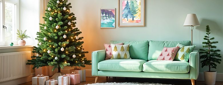
Living Room
Choose warm and inviting colors like earthy tones or soft neutrals to foster sociability and relaxation. Elevate the atmosphere with a touch of contemporary charm through carefully curated modern wall art.
- Earthy Tones: Browns, beiges, and warm grays create a cozy and grounded ambiance, encouraging conversations and relaxation.
- Soft Neutrals: Creams and light grays bring a sense of openness and warmth, making the living room a welcoming space for gatherings.
Kitchen
Enhance appetite and culinary experiences with stimulating colors like reds, oranges, or warm yellows. To amplify the culinary ambiance, consider adorning your walls with bespoke kitchen wall art.
- Fiery Reds: Stimulate appetite and create a vibrant energy, making the kitchen a lively hub for cooking and socializing.
- Warm Yellows: Bring in a sunny disposition, fostering a positive and energetic environment for meal preparation.
Bedroom
Create a peaceful oasis with calming colors such as soft blues, greens, or soothing pastels. Elevate the serene ambiance by integrating a nature-inspired customized wall art like sunflower tapestry or tree tapestry.
- Soft Blues: Evoke a sense of tranquility and calm, promoting a restful and serene atmosphere for sleep.
- Soothing Greens: Connect with nature and instill a feeling of balance and relaxation, ideal for unwinding after a long day.
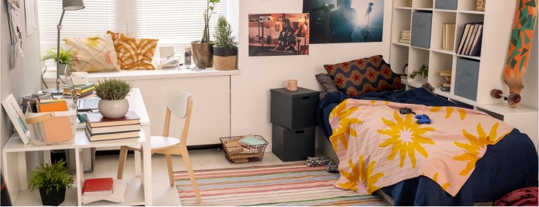
Home Office
Boost productivity and foster concentration in your workspace by incorporating soft pastels like light pinks and mints, and neutral grays. Infuse an extra burst of energy with vibrant accents like colorful wall art, large wall art and huge wall art pieces.
- Neutral Grays: Light gray tones offer a sophisticated and neutral backdrop. They can be paired with accent colors for visual interest.
- Energetic Accents: Introduce pops of energizing colors like yellows or oranges to stimulate creativity and motivation.
Bathroom
Promote relaxation and rejuvenation with spa-like colors such as tranquil blues or serene greens. The soothing colors and unique wall decor including canvas wall art, and custom wall tapestry create a harmonious retreat that invites you to unwind and escape the stresses of the day.
- Tranquil Blues: Mimic the soothing tones of water to create a spa-like ambiance, promoting relaxation during baths or self-care routines.
- Serene Greens: Infuse a sense of nature and calmness, turning the bathroom into a rejuvenating retreat
By understanding the impact of colors on perception, you can transform any room, regardless of its size, into a space that suits your preferences and lifestyle. Whether you aim to expand the visual space in a cozy nook or create intimacy in a grand living area, the right color choices can work wonders.
No Comments